Case study · Product vision · Service design · U.S. Office of Personnel Management · 2026
Redesigning the federal hiring experience around one unified record
Thirteen million people apply for federal jobs every year across three separate systems, and OPM set out to bring them together around one hiring record. I led the design of the vision: the principles, the service blueprint, the first prototypes, and the MVP that Tech Force will build. We had one month to set the direction and seven weeks in all.
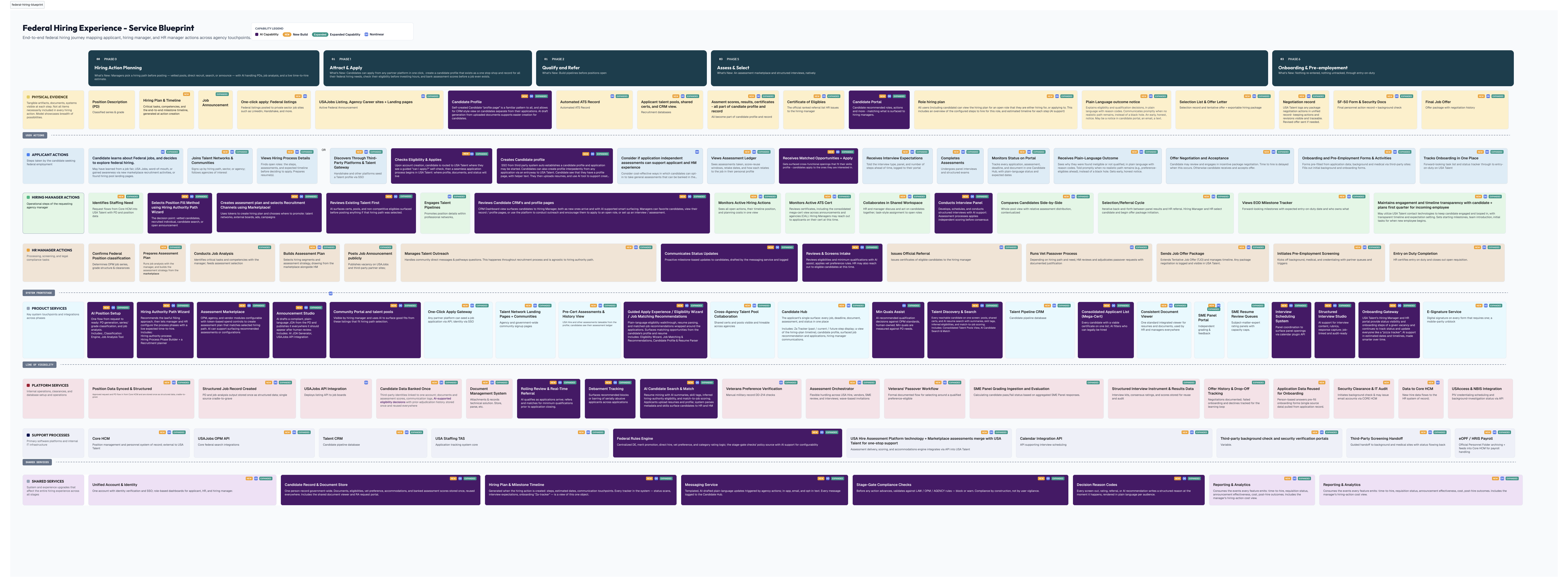
The service blueprint I built. Phases run across the top, and people and services run down the side. Purple is AI-assisted, orange is new, green is expanded. Click to open full size.
The problem
Federal hiring runs on a job board, an applicant tracking system, and an assessment platform. Each one works. An applicant still types the same information three or four times, and hiring managers keep the real process in a spreadsheet.
My role
Lead UX designer on a core team of four to six. I led the vision work and co-led the workshops, synthesized the research, built the service blueprint, prototyped the first screens, and wrote the brief the build team started from.
What happened
The eight principles from our workshop became acceptance criteria for the integrated system. Tech Force is taking our roadmap and MVP to build it, with our team on call as consultants.
TeamLead product owner, a federal UX researcher, the product owners of the three systems, HR and policy experts on call ToolsFigma, Figma Make, Mural, Claude, Claude Code
Decision
The first screen was wrong
Before our team had agreed on what the product was, I was asked to mock up a landing page. I designed a launcher with one tile for each of the three hiring systems, the way Adobe presents its suite of apps. It kept the three-product model leadership wanted to leave behind.
I shelved it and argued for a different order of work: agree on principles, map the service end to end, and only then decide what belongs on a screen. That became our plan for the month.
Context
The question we were asked
OPM runs federal hiring on several legacy platforms, including USAJOBS and USA Hire. This project is the one meant to take all of that work, re-architect it, and redesign it as a single experience for everyone who wants a federal job.
OPM's leadership asked the agency's in-house product incubator, where I was working, for something bigger than another round of fixes. If you could start from scratch, what's the most ambitious system you could design? The program lead gave us one sentence to measure every idea against.
"Decrease the space between an applicant and a selection."Program lead, OPM
Alignment
First, agree on what you refuse to become
I designed and co-led a two-hour workshop with the product owners of all three systems, HR specialists, and policy experts. Small groups took one theme each from the research. Before a group could say what the platform should do, it had to name the opposite: what do we refuse to become?
People found it much easier to agree on what they hated than on what they wanted, and the principle was usually right behind the complaint. Nine themes became eight principles, each in the same shape: because something is true about federal hiring, the platform should always do this and never do that. Here's the shortest one:
Because the federal hiring process is complex, the platform should always inform, guide, and update. It should never leave people guessing what to do or where they stand.
Afterward, I used AI to pull the scattered ideas into draft principle statements, which the team and I edited and fact-checked.
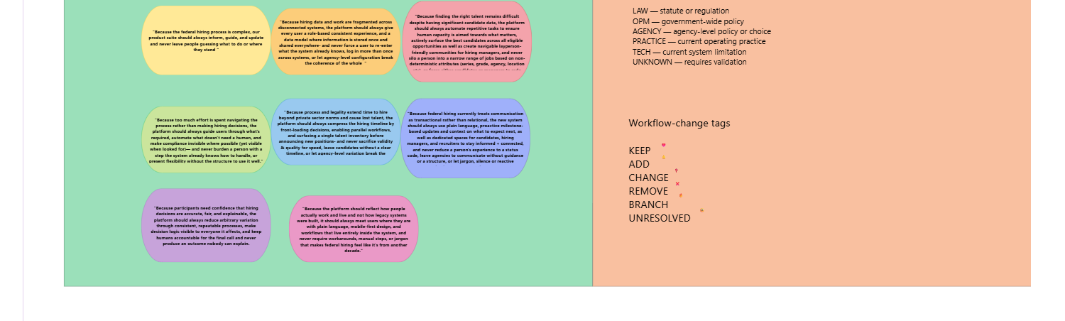
The eight principles on the workshop board. Each constraint is tagged by where it comes from: law, OPM policy, agency policy, practice, or technology.
Read all eight principles
Clarity of status
Because the federal hiring process is complex, the platform should always inform, guide, and update. It should never leave people guessing what to do or where they stand.
One record
Because hiring data and work are fragmented across disconnected systems, the platform should always give every user a role-based, consistent experience, built on a data model where information is stored once and shared everywhere. It should never force a user to re-enter what the system already knows, log in more than once across systems, or let agency-level configuration break the coherence of the whole.
Candidate matching
Because finding the right talent remains difficult despite significant candidate data, the platform should always automate repetitive tasks so human capacity goes toward what matters, actively surface the best candidates across all eligible opportunities, and create navigable, layperson-friendly communities for hiring managers. It should never silo a person into a narrow range of jobs based on non-deterministic attributes (series, grade, agency, location).
Reduce busywork
Because too much effort is spent navigating the process rather than making hiring decisions, the platform should always guide users through what's required, automate what doesn't need a human, and make compliance invisible where possible, yet visible when looked for. It should never burden a person with a step the system already knows how to handle, or present flexibility without the structure to use it well.
Speed to hire
Because process and legality extend time to hire beyond private-sector norms and cause lost talent, the platform should always compress the hiring timeline by front-loading decisions, enabling parallel workflows, and surfacing a single talent inventory before announcing new positions. It should never sacrifice validity and quality for speed, or leave candidates without a clear timeline.
Human communication
Because federal hiring currently treats communication as transactional rather than relational, the platform should always use plain language, proactive milestone-based updates, and dedicated spaces for candidates, hiring managers, and recruiters to stay informed and connected. It should never reduce a person's experience to a status code, leave agencies to communicate without guidance or structure, or let jargon, silence, or reactive communication represent the government's relationship with its candidates.
Explainable decisions
Because participants need confidence that hiring decisions are accurate, fair, and explainable, the platform should always reduce arbitrary variation through consistent, repeatable processes and make decision logic visible to everyone it affects, with a human accountable for the final call. It should never produce an outcome nobody can explain.
Meet users where they are
Because the platform should reflect how people actually work and live, not how legacy systems were built, it should always meet users where they are with plain language, mobile-first design, and workflows that live entirely inside the system. It should never require workarounds, manual steps, or jargon that makes federal hiring feel like it's from another decade.
Synthesis
221 sticky notes
I used Claude and Claude Code to sort and cross-reference hundreds of overlapping observations, and made the calls on merging and wording myself. The result was 221 items, 102 pain points and 119 opportunities, organized by theme, by user, and by stage of hiring.
Then I compared that list with the feature list leadership had been keeping. What people had talked about most was a single place where an applicant could see every job, deadline, and status in plain language. The feature list had nothing like it.
I also pulled out the standards every feature has to meet and turned them into a ten-item definition of done. That made "mobile-first" a test a feature could fail, not just a sticky note.
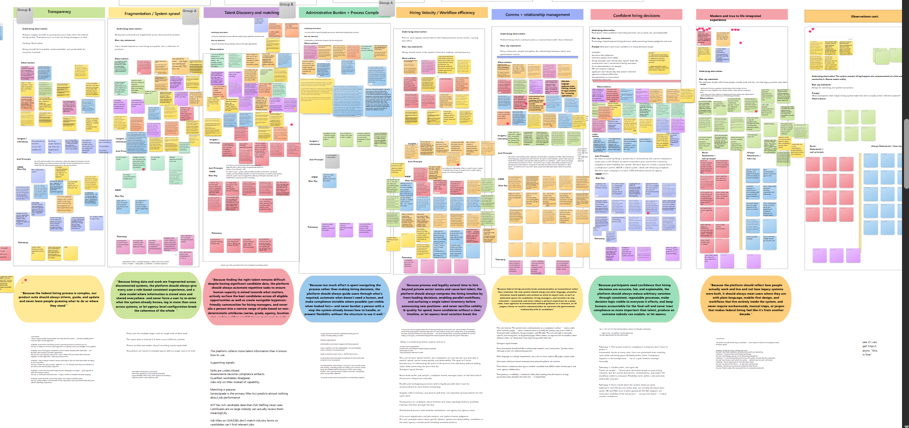
The workshop wall. Each cluster runs from raw observations to the thing we refuse to become to the principle that came out of it.
Design
One picture everyone could read
All of it went onto one service blueprint: seven phases of hiring, from planning a hire through onboarding, with lanes for the applicant, the hiring manager, HR, and the services underneath. Every card is tagged existing, expanded, or new, with a marker where AI is involved, so an executive can read only the "new" cards and get the strategy.
The blueprint also settled whether to organize the work by leadership's six modules or by the stages of hiring. I proposed the stages as the spine, with a thin strip showing which module each stage belongs to. The hiring record runs as a single lane under every phase. That lane is the picture of "one record, many experiences."
About 60 percent of what the blueprint called for already existed somewhere in the three systems. So the delivery plan I drew alongside it connects what's there before it replaces anything.
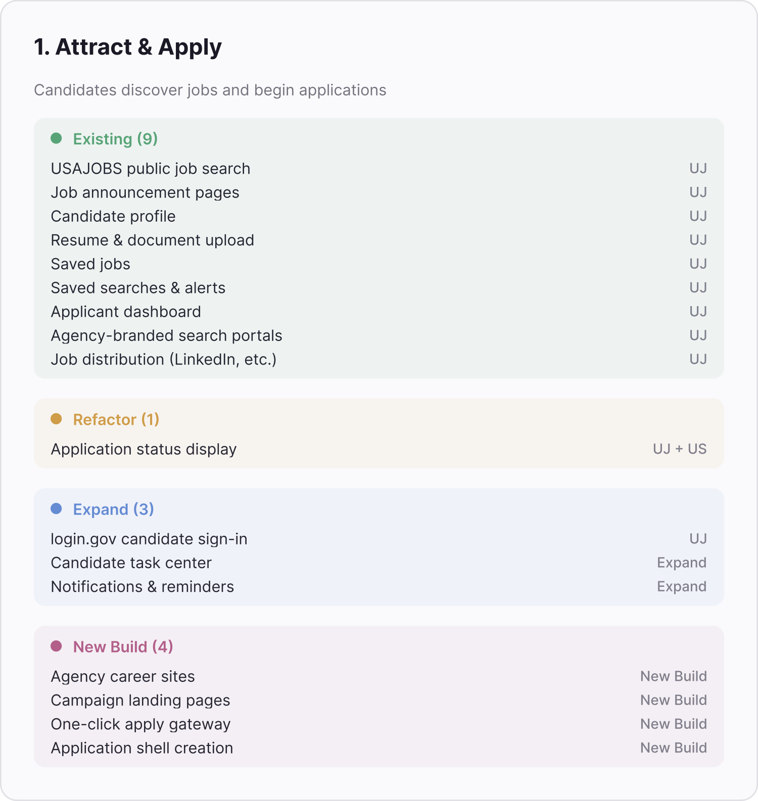
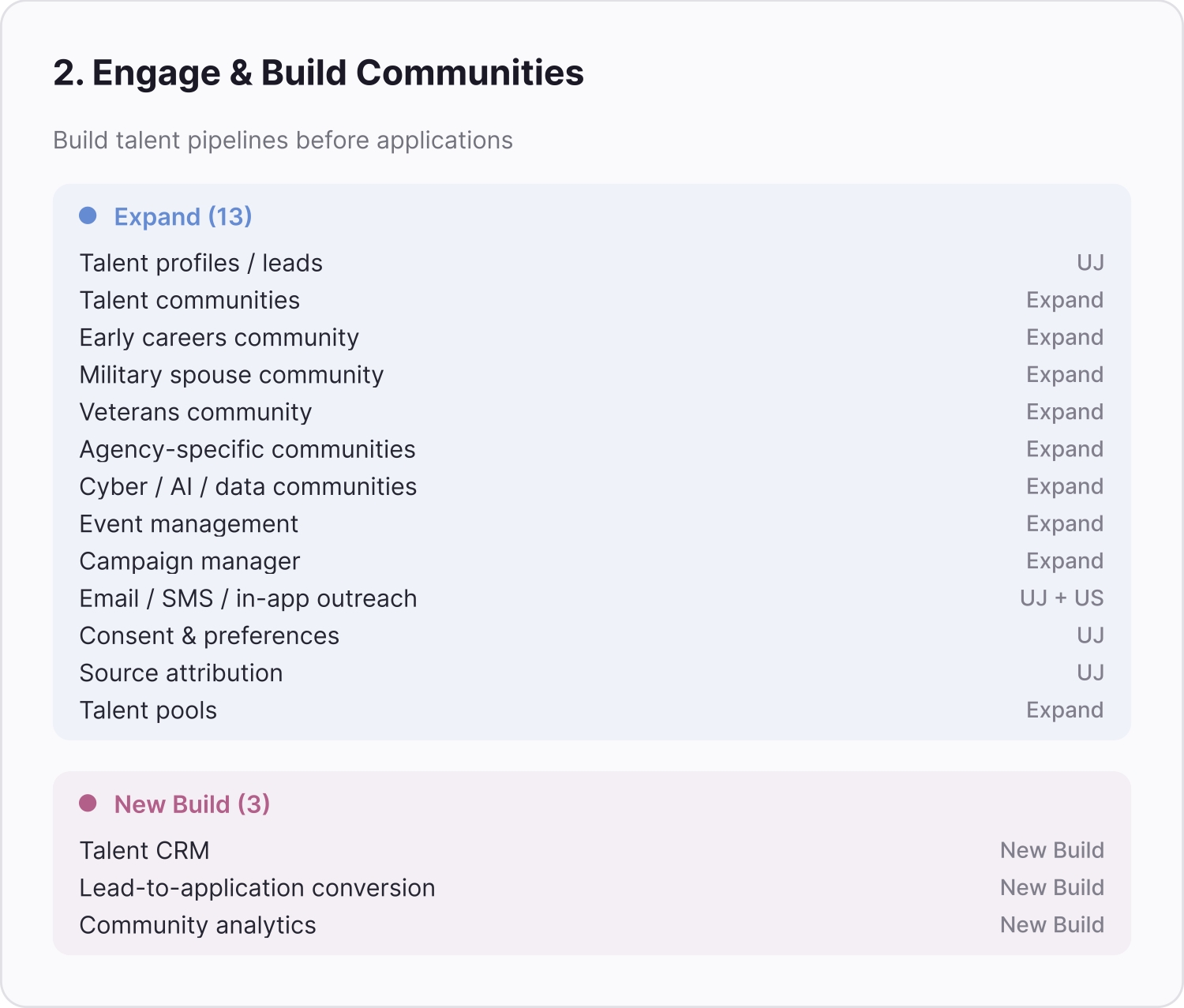
Two phases, rolled up for leadership. Each summary counts what already exists, what gets refactored or expanded, and what has to be built new.
Collaboration
Making five deliverables tell one story
Eight days before the presentation, we had five deliverables owned by five volunteers. I wrote a one-page memo for the morning stand-up to pull them into one story. It listed eight open items that had no owner, set a content freeze for that Friday, and named seven policy questions to raise with leadership before they came up in Q&A.
Prototypes
One profile per person, not per application
I prototyped two screens in Figma Make. The first is a hiring manager's dashboard, with some candidates surfaced as recommendations. The second is a candidate profile built around the person instead of the application.
Today, each application carries its own copy of someone's information. In the profile, one applicant has all of their applications in one place, along with their uploaded files, like different résumés or a master bio, and their skills. People can add skills themselves, or AI can pull them out of the documents they upload. Those skills become searchable for federal HR and become the basis for matching.
The goal is to match on skills instead of job titles, so people can be found for jobs they didn't know they'd fit. Whatever the AI suggests, a named person makes the decision.
AI in my workflow
How I used AI on this project
- Claude and Claude Code, to sort and cross-reference hundreds of overlapping observations into the 221 items.
- AI to try out different structures for the principles workshop before I ran it.
- AI to turn scattered workshop ideas into draft principle statements, which the team and I edited and fact-checked.
- Figma Make for the early product screens, and to push a change, like a new tag design, across dozens of blueprint cards at once.
Handoff
Handing it over
The engineers taking this on were new to federal hiring. My first draft of their brief read like our team giving orders, so I rewrote it as evidence: pain points in users' own words, each paired with the opportunity it opens. I took out every line that called the current systems broken and let the quotes speak.
I also cut "one login" from the problems once we confirmed the government's shared sign-in already handled it. Then we walked the blueprint with the engineers in person and scoped the MVP together.
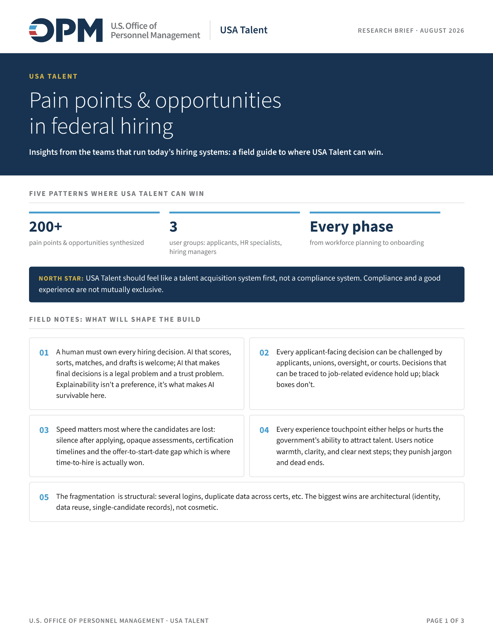
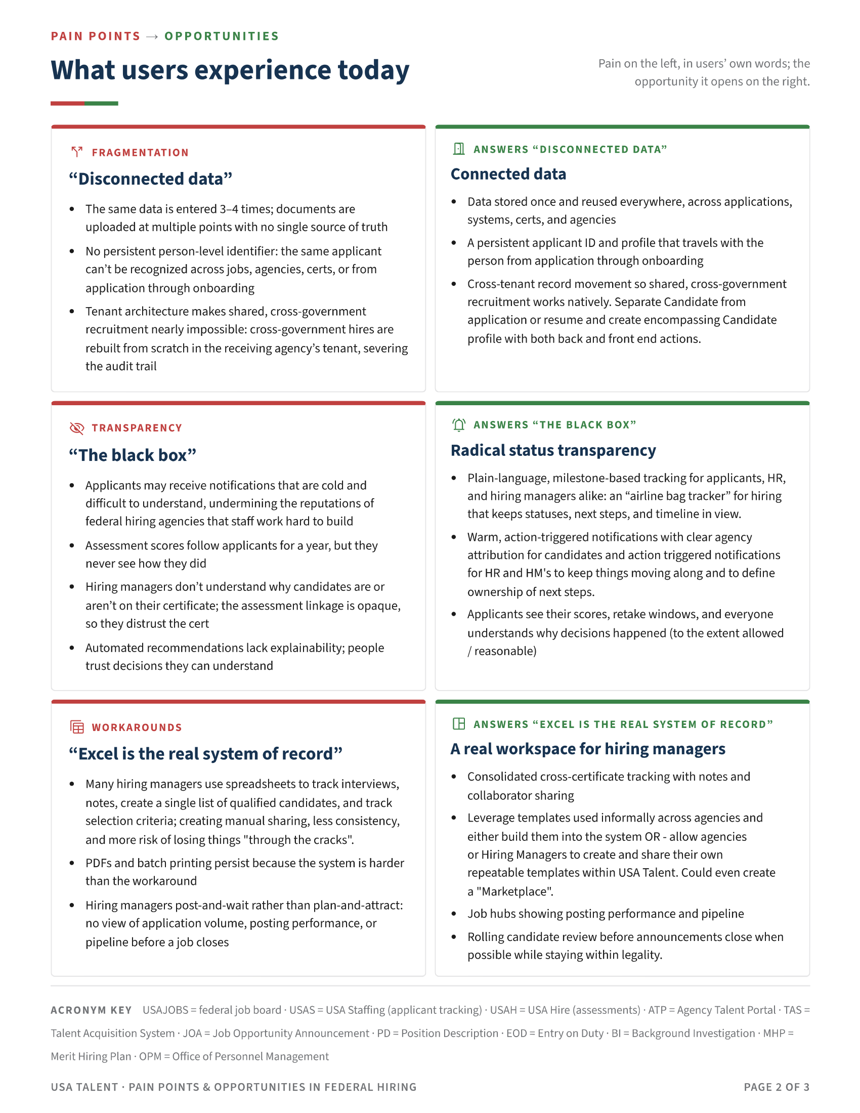
The research brief the engineers received. The goal and five patterns, then each pain point in a user's words, paired with the opportunity it opens.
Outcome
What carried forward
The eight principles became acceptance criteria for the integrated system, giving product and engineering a durable way to judge proposed changes. Tech Force is taking the roadmap and the MVP I helped shape in our in-person workshops, and it will build the product with our team on call as consultants.
I rolled off after the handoff. I'm proud of the impact it will have, even though I won't be around for the build.
Reflection
What changed my practice
Alignment gets much easier when people have something tangible to challenge. Here that was the list of things we refused to become, and later the blueprint. By the time engineering joined, the question had become what belongs in the first release and what can wait.
I wanted to stay on through the UI build. The build went to Tech Force, so my part ended with the vision, the roadmap, and the MVP.
I would also change one thing about the handoff. Our own team went into it with unresolved differences about the prototypes and the vision, and some of that was settled in front of the people inheriting the work. It worked out, but I would not plan on it working twice.